Let’s face it, we all probably hopped on the gray bandwagon, either willingly or unwillingly over the past several years. Walls, furniture, accessories, and construction materials, like tile and flooring, all contained gray color variations. Gray is still popular, but it is slowly giving way to beige. Yes, beige. Now don’t groan those of you who remember the boring beige days popular 15-20 years ago. The new beige colors are spectacular! Current design trends are featuring, “earthy and warm neutral tones like beige, khaki, tan and greige (a mix of warm gray and beige) paired with trends such as nature-inspired looks and designs that promote wellness,” says Houzz contributor Becky Harris.
Here we will look at several of my favorite go-to beige colors from Sherwin-Williams and Benjamin Moore. Take from my inspirations to seek out your favorite beige colors and incorporate them into your home. You’ll find that the colors will add a calm, comforting and inviting feeling to your space.
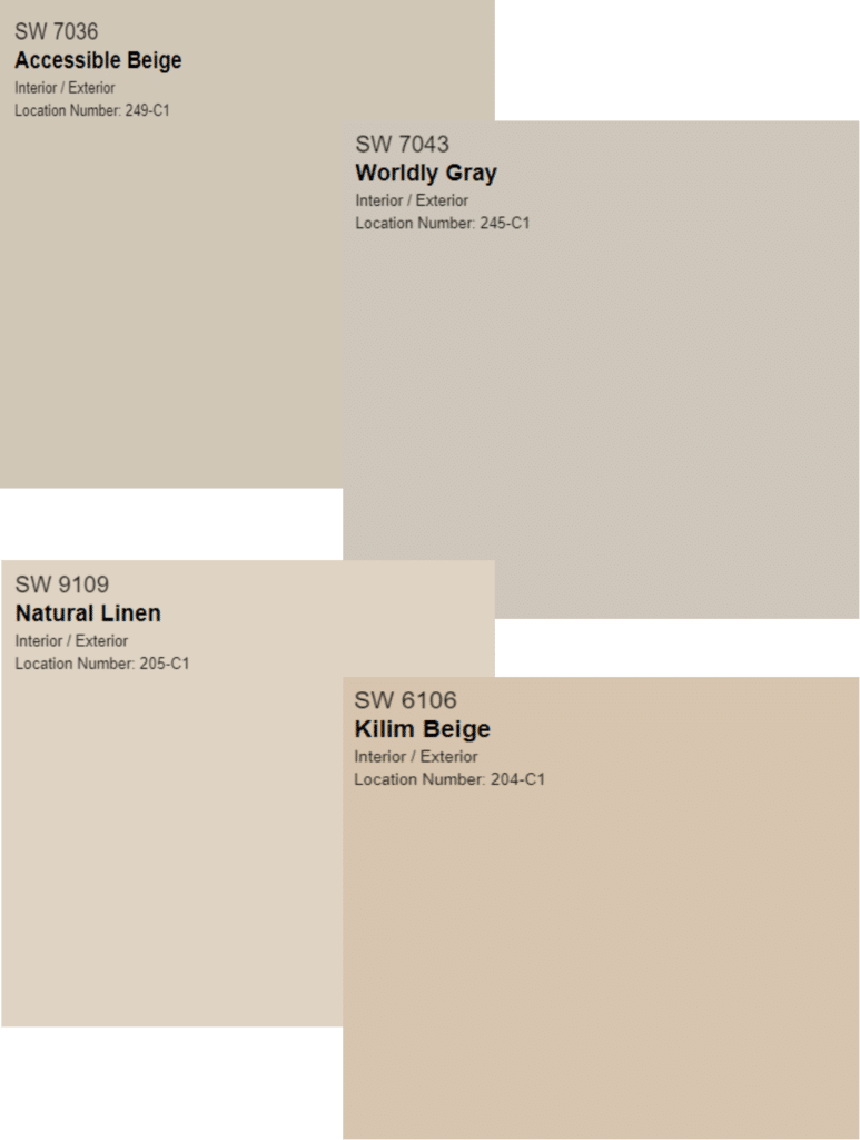
Let’s start with some of my favorite beiges from Sherwin-Williams:
Accessible Beige
The name speaks for itself. This is a tried and true paint color. Its chameleon color morphs to perfection in any space creating a softness and blending with other colors seamlessly. Whether you have a modern or traditional style, Accessible Beige provides a smart backdrop for other design elements.
Worldly Gray
Worldly Gray exhibits beiger tendencies to help soften a space. It is a true gray that doesn’t feel too cold. Use this color to warm up a home with cooler gray tones. It has enough warmth to avoid the concrete feeling and it doesn’t have any undertones of blue.
Natural Linen
This paint color keeps the mood light and airy. Natural linen works with warm and spicy hues. This color looks fabulous in coastal-inspired interiors.
Kilim Beige
Kilim Beige is ready to prove itself a worthy color as the pendulum swings back to soft neutrals. This color imbibes earthiness and brings softness into a room. It’s grounding nature anchors a space and lends itself to beautiful combinations with today’s blues and greens. Ahh, feel the freshness in the air!
Like Sherwin-Williams, Benjamin Moore’s collection of beiges excite the senses. Here are some of my beige quick picks from Benjamin Moore.
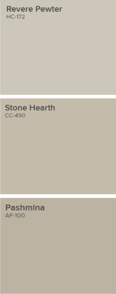
Revere Pewter
Benjamin Moore’s Revere Pewter is light gray with warm undertones… a true greige. It allows the space to feel inviting by creating a comfy mood. Revere Pewter is soft and subtle while still being neutral. This classic shade creates a unifying look that calms and restores. A great transitional color, it’s perfect for an open floor plan.
Stone Hearth
Stone Hearth is one of those warm, slightly darker, transitional colors that works well with existing gray tones. This color is part of the Classic Color Collection. It is timeless and elegant but forward. Pair it with BM Mt. Rainier Blue for a sophisticated look.
Pashmina
Pashmina works well with a wide range of browns as well as grays because its sandy hue gives it a chameleon-like quality. It is part of the Affinity Color collection. A sophisticated palette of harmonious hues. It can stand on its own or in combination with any other color in the Affinity palette.
It’s time for a refresh from the grays of the past several years. By that I mean, you don’t have to paint every gray wall in your home. Be choosy and pick a space to incorporate one of the new beige colors and update your design to promotes wellness. The new look will please the eye as well as the soul.
Wishing you and yours good health and well-being.
Comments 37
Such beautiful design!
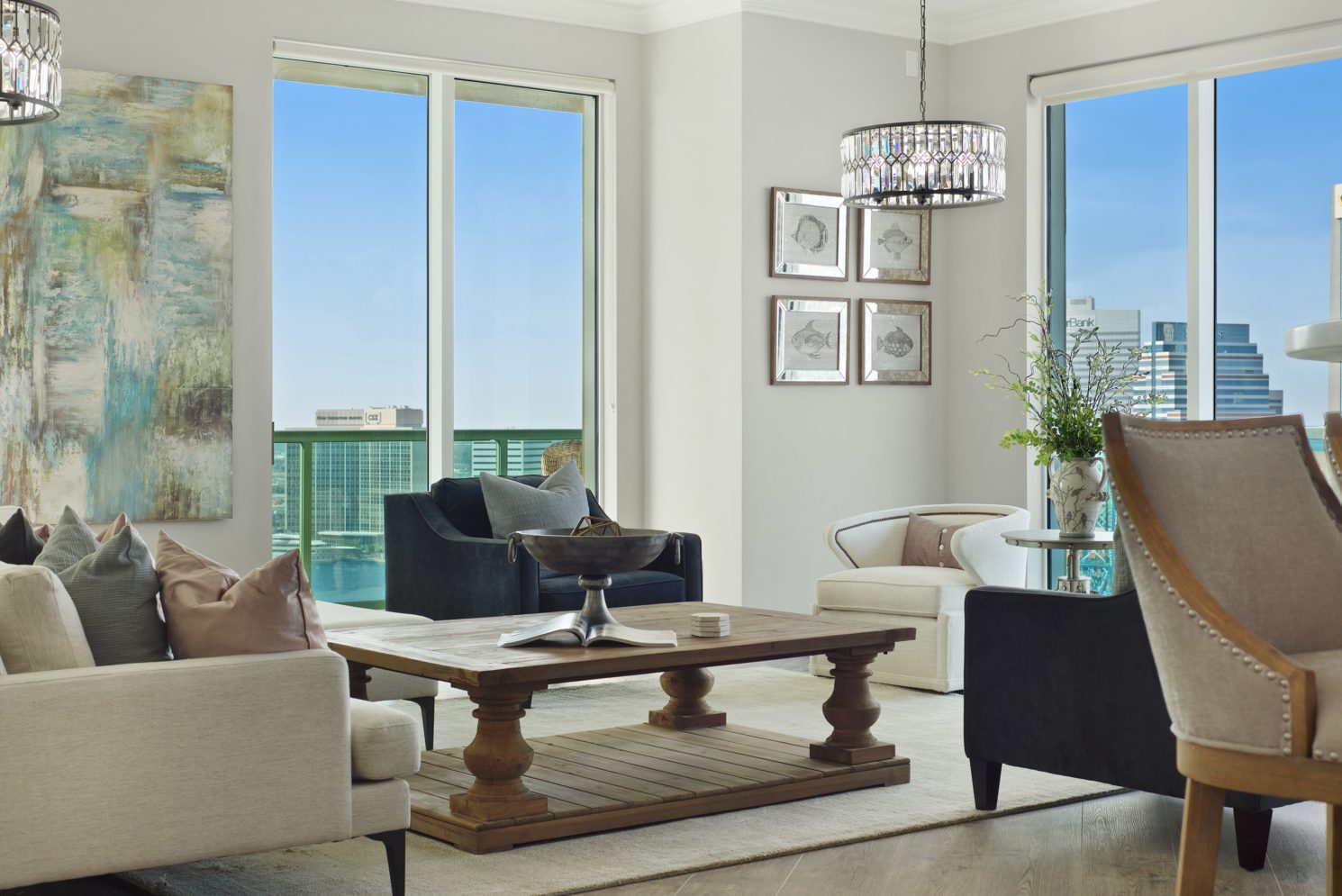
Thank you very much! This was a fun project renovating a hi-rise condo in the city overlooking the river!
A great guide to going beige without going overboard. I love the colors you are recommending!
Thank you Lisa! I’m glad you enjoyed it!
Great post, Donna! Definitely a perfect resource! These are all my favorite tones too! Glad to see they’ve been updated, but still classic! Saving this one for sure! xox
Thank you Laura! I do think they’ll remain classics as they’re so versatile and work beautifully with beige and gray alike!
There’s beige and there’s bad makeup beige…Some of my favorite “go to” beige-y neutrals are represented here! Nice choices!
Thank you Janet! Yes, you are absolutely right about bad beiges. When colors are versatile and sophisticated they’re winners!
A really great guide to some lovely beige’s. We have Revere Pewter and Pashmina in our home. We renovated 6 years ago and I still love how versatile the colors are.
Sheri, thank you! That’s funny you say that because we have those same two colors in our home as well! I’ve always loved them no matter the trend!
Accessible Beige and Natural Linen are two of my favorites. Thanks for the nice round up of beiges, seems like a lot of people are leaning towards beige again.
Thanks for following along Mary Ann. We’re seeing our clients leaning toward warmer neutrals, but what I love most about these is how versatile and adaptable they are!
I love how much warmth beige adds to your home. Beautiful design and wonderful picks!
Julie Ann, thank you for your kind words. Choosing the right beige will certainly help keep things warm, inviting and timeless.
These color palettes are so calming, Donna. Perfect for a coastal resort location!
Thank you Leslie! Yes, we find quite a bit of success with these warmer, more classic selections in our Florida, coastal-inspired spaces.
I always love learning about new paint color options! Thanks for sharing!
Thank you for following along Leslie, and you are very welcome! I’m glad that you enjoyed the post!
The room is beautiful. Are the floors wood or ceramic? The color looks so beautiful with the art and walls.
Author
Thank you for your kind words! The floors in this home are luxury vinyl plank.
I am planning on painting my house Natural Linen and looking for a complimentary color for the ceilings. Do you have any suggestions?
Author
Thank you for following along Chrissy! … Color is very complex and specifications are difficult to make without knowing what else is involved in the overall design, but a lighter version of your wall color, say 25%, is always a beautiful option.
What did you decide on for a ceiling color?
I have a medium warmer wood trim and I am going to do the natural linen on my walls but I am trying to figure out ceiling colors myself.
Thanks!
What wall & trim color was used in your photo, please?
Author
I guess that means you like it? … We used SW Accessible Beige here and the trim color is a custom mix. Thank you for following along.
What does warm and spicy hues mean when talking about what natural linen goes well with?
Author
Thank you for following our blog! … Warm refers to the nature of the undertones of the colors. Generally, yellows, reds, and oranges are warmer than blues and greens. Spicy refers to exactly the type of colors you might come to mind when you think of spices!
Thank you for the article. I enjoyed reading about the new trends. I prefer warmer tones and do not consider trends in my home. I never embraced gray as it’s to cool for me. I’ve stuck with the warm neutrals for 20+ years.
In our new home, it’s all gray in my eyes. We are repainting. Our kitchen is currently painted in Accessible Beige receiving lots of natural light. The color changes throughout the day but definitely leans strongly gray in my space.
Author
We’re glad that enjoyed the article Amy. Color is such a challenging decision because so many are true chameleons and change during times of the day, changes in weather and times of year. Accessible Beige can definitely lean both ways.
I love BM Natural Linen. Can you suggest a good trim color that works well with it?
Thank you,
Janice
Author
Hi Janice! Thank you for following along, and sharing your feedback. Yes, we love Natural Linen as it exudes warmth and coziness. Colors are affected by many factors within a space, especially natural light, so it all depends on what you’re going for. I always recommend narrowing down to a few choices and putting them on your walls or trim so that you can assess them at all times of day and in different weather conditions.
Would Pashmina and Revere Pewter look good in the same room. Would Pashmina provide enough contrast? Thanks
Author
Hi Janice, and thank you for taking the time to read our blog post. Pashmina and Revere Pewter are both gorgeous warmer neutrals. I think they look lovely together, but your question about having enough contrast is difficult to answer without seeing your home, understanding your color palette goals, and knowing what you personally prefer as a contrast. You can’t go wrong with either.
so few online photos of rooms painted SW Natural Linen….any ideas where to look for inspiration? Have any recent pics?
Author
Thank you for taking the time to enjoy our blog post. Unfortunately, we do not have any photos of Natural Linen in our projects. I think you’ll find Pinterest to be your best source of inspiration. You’ll see links for other blogs, photos of the color used in various spaces, and even palettes built around that warm neutral. The SW color of the year, Evergreen Fog, is a beautiful complement.
I’m so torn in choosing an exterior paint color. We are between Accessible Beige (SW) and Revere Pewter (BM).
Any thoughts on using one of these on a south facing house?
Author
Lisa, thank you for your question…You’re definitely considering two beautiful options. Although very similar, Accessible Beige is slightly lighter and warmer than Revere Pewter and will look slightly more beige than gray. I always recommend our painter to apply samples to our projects so that our clients can view both at all times of the day and in all types of weather. Try doing that and I’m sure you’ll find a favorite of the two!