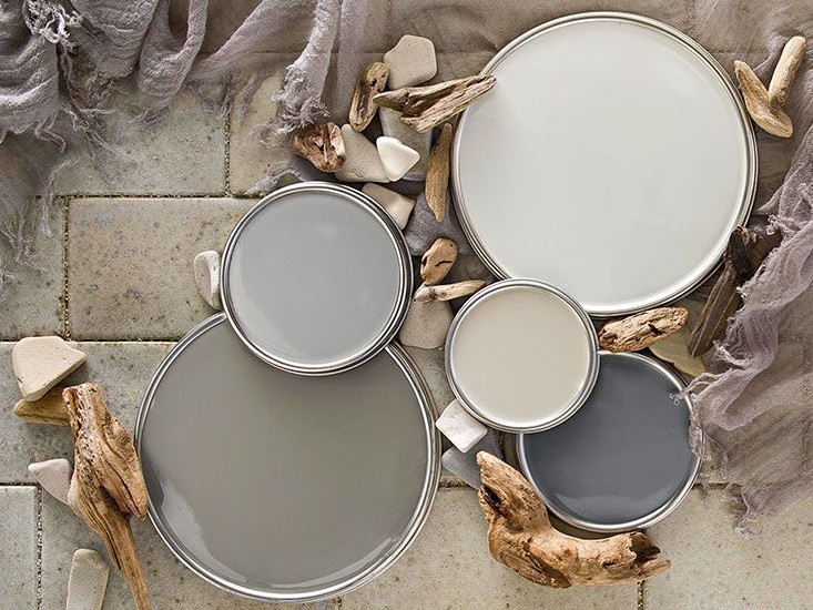
If you follow design trends at all, or even if you love to flip through decorating magazines, you’ve probably noticed that gray has become this decade’s new neutral. It has pushed our once loved beige to the back burner as the most popular color choice for walls. A true neutral gray is a mix of black and white, but rarely do we see a true neutral gray in home decor. Instead, what we’re most likely to find is an endless array of warm and cool gray tones. Cool grays have a blue undertone and are crisp and almost icy in feel and appearance. Warm grays, on the other hand, have yellow or brown undertones and can oftentimes look almost beige. Cool grays look beautiful, and even more sophisticated when paired with crisp white trim. Warm grays are generally best paired with ivory, cream and other warm colors with a pink or yellow undertone. Of course, I believe there are no hard and fast rules in design, just pairings that make the most sense for each individual space and the people who spend time in them. If you’re considering a new palette, here are some of my favorite grays . . .
1. Benjamin Moore’s Revere Pewter HC-172 . . . A classic light gray with warm undertones. It’s soft, calming and sophisticated. A perfect transitional color.
2. Benjamin Moore’s Kendall Charcoal HC-166 . . . A rich, deep, luxurious gray that pops beautifully with crisp white trim and works well with most color schemes.
3. Sherwin Williams’ Magnetic Gray SW 7058 . . . A soothing, silvery blue-gray that’s a stunning choice for a foyer or formal living area.
4. Benjamin Moore’s November Rain 2142-60 . . . A mid-tone putty color that’s warm, but not too warm. Looks great in formal and casual spaces alike.
5. Sherwin Williams’ Functional Gray SW 7024 . . . A warm mid-tone color that’s one of Pottery Barn’s choice colors for their 2014. It’s sophisticated and looks terrific in any space.
Comments 2
Do you think SW magnetic gray is too much for a bedroom space. We want the guest bedroom to be cozy. We have mid tone wood furniture in the room as well (maple). Thanks for your input.
Author
Hi Laura, and thank you for following along! I happen to love Magnetic Gray for a variety of reasons. First, it’s a chameleon gray that goes blue or green depending on the lighting and the other elements in the room, and it adds color without being overwhelming. It looks great where there’s plenty of natural light, but if not, it will give you even more of that cozy vibe you’re going for. It should look great with the maple wood tones, and you might consider adding layers of cream and ivory.